Sickla Tunneln
IN PROGRESSA self-learning prediction model for tunnel closures on the Stockholm commute.
Why Sickla Tunneln exists
Sickla tunnel closes multiple times a day under congestion — adding 15 to 30 minutes to the commute when it does, with no warning. Existing tools react: navigation apps reroute after the closure, not before. Sickla Tunneln tries the inverse — a self-learning prediction model trained on six-plus weeks of live tunnel-event data, attempting to forecast closures from historical patterns, calendar effects, and real-time traffic flow. The decision lands at the breakfast table rather than in the car.
The project started in March 2026 as a data-collection prototype — for the studio's own commute through that tunnel. The current build runs end-to-end and ingests live tunnel events, but the self-learning capabilities are still being evaluated against real outcomes. Whether the model's forecasts hold up against actual closures over months, not days, is the open question this MVP exists to answer.
Screenshots
What it does
Self-learning prediction model
Predicts tunnel closures from historical patterns, calendar effects, and real-time traffic flow. Trained on the project's own ingested tunnel-event data, currently six-plus weeks deep.
Pre-trip decision tool
Designed for the breakfast-table check, not in-car navigation. The visitor opens the app once before leaving home and gets one answer: leave now, or wait twenty minutes.
Hyper-local — one tunnel, deep
Sickla tunnel only — Södra länken, Väg 75, Stockholm. The narrow scope is the design choice; going wider is a different problem.
Glanceable UX
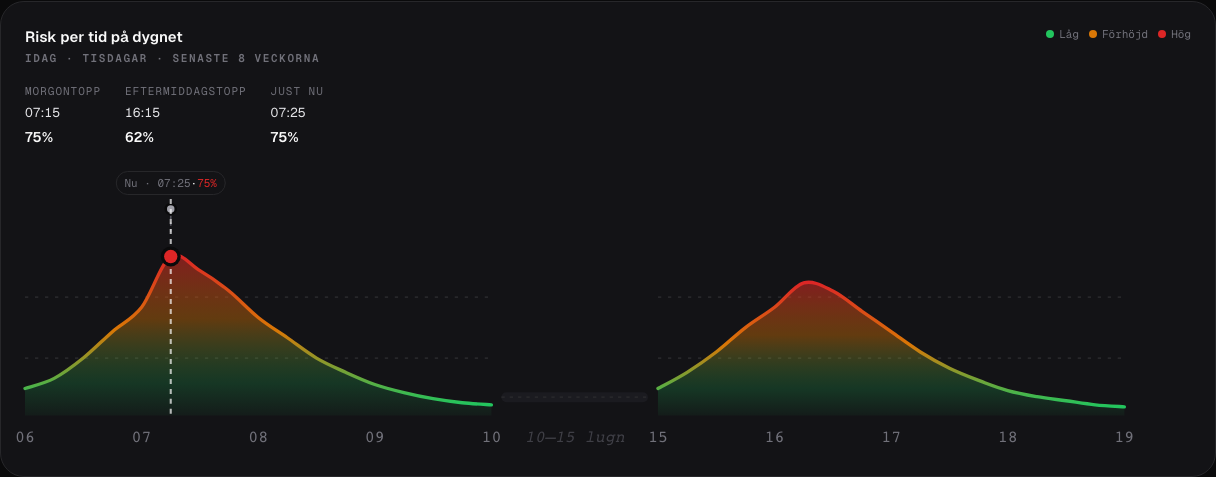
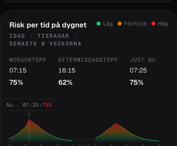
Under two seconds to comprehend. Risk score, suggested departure window, expected reopen time — no reading required.
Personalised arrival risk score
The risk percentage adapts to the visitor's location and departure time. A commuter leaving earlier or from further out gets a different score than one leaving later from closer in.
Where we are
Done
- Six-plus weeks of live tunnel-event data ingested.
- Risk-by-hour widget shipped — area-chart redesign (PRD-005g).
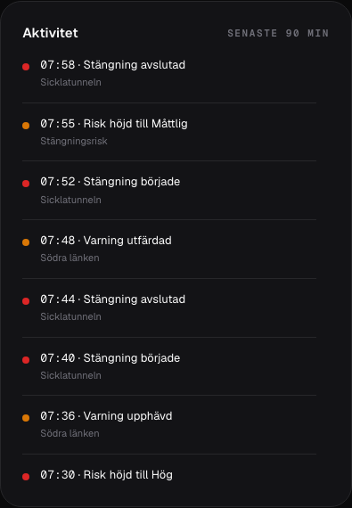
- Activity feed card with bounded scroll and republish merge.
- /api/risk, /api/opening, /api/activity, /api/forecast/by-hour endpoints live.
- Weekly Monday 04:00 evaluation cron running; baseline metrics available.
Next
- Evaluate self-learning capabilities against real-world outcomes over months, not days.
- Decide whether the model extends to other Stockholm tunnels — or whether rule-based heuristics still beat it for this kind of hyper-local prediction.
Build notes
- Six-plus weeks of live tunnel-event data ingested.
- Risk-by-hour widget shipped (PRD-005g — area-chart redesign).
- Project started — scaffolded into Agent Dashboard, vision drafted, data ingestion specced.